Why should I care about web accessibility?
Your checklist of items that need to be in place before you launch a web site grows every day. Accessibility seems scary because, if you have any exposure to it, you know it gets tacked onto that list, and it expands to a hundred other little checks and fixes you have to make before launch.
Accessibility in terms of web development means making your web sites usable by people with vision, hearing, or other limitations. The web is built with this kind of usability in mind and a lot of it comes for free. The biggest problem is, it’s easy to break, and many common web development practices can and do break it.
Not to discount the difficulty of making a web site accessible. It still involves being aware of what you shouldn’t do and what you must do. You may be forced to change the way you work or the way you achieve certain aesthetics or functionality on your sites.
It may even lead you to re-evaluate how important certain features or visuals are in the context of your app. All this is in the service of making your app more usable. In most cases, you’ll make it more usable for users with additional challenges and for users without.
And, if that’s not enough motivation for you, you could get sued if your site isn’t accessible! That’s right! Even if you don’t care about making your site more usable for everyone, you probably would prefer not to have your bank account emptied. Your altruism muscle may be a bit out of shape, but you still have a compelling reason to pay attention to accessibility.
I’m not speaking in academic terms (i.e. you could get sued for your web site in the same way you could get sued for literally anything someone can dream up). These lawsuits are actually happening, plaintiffs are winning, and companies are being ordered to remediate their sites to comply with the Americans with Disabilities Act.
If you develop a site without considering accessibility, it’s not likely a resulting lawsuit will target you directly, but the damage to your reputation could be a big problem. Not many companies will hire a developer knowing the last company got sued over the web site they built. Even as an employee of a company, you could get laid off due to budgetary constraints in the fallout of a lawsuit. If you built the site that triggered said lawsuit, you’re going to be the first out the door.
Making It Personal
This was all academic until something happened in my life that connected me intimately to the whole accessibility thing. My daughter was diagnosed with Stargardt disease at 12 years old. This is causing her to lose her central vision. Her visual acuity with her glasses is 20/100.
If you’re familiar with that vision test chart (called the Snellen chart) that starts with the “E” at the top, she is able to read the second line down (the one under the “E”).
This means that, now, the level of richness in her participation in the world from here on out is in the hands of other people. People who probably have better vision than 20/100. People who still have their central vision. People like you and me.
Like any parent, I want her to be able to live a full and rich life, and having accessible web sites will go a long way toward making sure she can.
Hopefully by now I’ve mixed for you the perfect cocktail of inspiration and fear to convince you accessibility is important. If so, let’s look at some quick wins you can have today to jump-start your focus on accessibility.
Quick Accessibility Wins
Alternative Text
If you have elements on your site which are not text, you need to provide some sort of text alternative to make them accessible. You do this because low-vision users may use screen reader software which literally reads them the text of your web page. When it gets to an element that is not text, it needs some text to read so the user knows what that is.
The most familiar form of this is the image element’s alt attribute. Fill that with some text that describes the image. This means no more making an image a background image just to get those sweet background-size properties like contain and cover. (Actually, you can still do that, but you need to have an img element as well for screen readers.)
Form controls are another example of elements that need additional text. Make sure your form controls have associated labels. You can associate a label by making sure it has a for attribute with a value exactly matching the associated control’s ID. Here’s an example:
<label for="email">Email:</label>
<input type="email" name="email" id="email">
The only time you are allowed to omit alternative text is if the element is purely decorate. This is not your golden ticket to say that all your images are purely decorative and provide no alternative text. If an image conveys zero information that is not also conveyed elsewhere in the text, you can consider it decorative and leave the alt attribute empty like this:
<img src="decorative-cat-icon.svg" alt="">
The best way to decide if your web site is doing enough to provide alternative text is by using a screen reader yourself without looking at the site. If you’re on a Mac, you can easily turn on Voiceover from the Accessibility preference pane. On Windows, you can download NVDA for free, but, if you want to get really serious about testing, you should pick up a license for JAWS.
Contrast
Contrast is the difference in luminance between two colors. When we talk about contrast on the web, we’re generally talking about how easy it is to see text on top of some background.
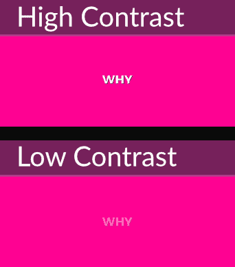
In the examples above, the high-contrast example is obviously easier to see, but I can see them both. Why should I care then?
People with low vision need that additional contrast to be able to make out the shapes and read the text. We can sorta-kinda simulate the additional difficulty a low-vision user might experience by taking the same example and making the text tiny. In the example below, even if you have great vision, it’s really tough to see the low-contrast text even though it’s the same color as before.
That’s great, but, if taken to its logical conclusion, this could lead to every web site being black text on a white background. While that’s great for contrast, it’s not always great for your brand or to create the kinds of emotional responses you want to create in your users.
Fortunately, the W3C has developed a set of standards around how much contrast is “enough” contrast. If you use Chrome’s developer tools, it’s easy to see whether or not you meet these standards. Here’s a video showing how that works, and how you can easily fix contrast problems.
Note: In recent versions of Chrome, this functionality is flaky. Best I can tell, it only works if both the foreground and background color styles are on the element you inspect. Check the next section on Axe for the best alternative I’ve found. Hopefully, Chrome’s built-in tool will soon be restored to its former glory.
Axe
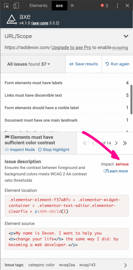
Axe is an accessibility testing tool. The easiest way to use it is by installing their Chrome plugin. Once this is installed, open the site you want to test, open developer tools, and click the “axe” tab. In the “axe” tab, you’ll click the “Analyze” button.
Axe will show you a list of accessibility issues. Click any of the issues, and you’ll see details of the issue. It will tell you the problem and allow you to inspect the offending element. It will also give you additional information about how to solve the issue.
If you haven’t been paying attention to accessibility, you might find this list intimidating. Fix the most serious issues first. You’ll find the “impact” in the details section after you click on one of the issues.
Ideally, you would want to have a clean scan from axe, but the fewer the better. Don’t feel like, if you can’t fix them all, you shouldn’t fix any. Even fixing a couple of the most problematic issues axe finds will make your web site or app significantly more usable.
Take the First Step
Pull up your current project right now and make sure all your images have alternative text. It’s such an easy way to get started! Then, install axe and run a scan before you call your app “done.” Use Chrome’s contrast tester to adjust colors so that they’re visible for all your users.
The steps are easy and don’t take much time to implement. Once you get used to them, you’ll naturally become pro-active, and your pre-launch checks will start revealing fewer problems. You’ll be making it easier for more people to use your site. If that doesn’t motivate you, you’ll decrease yours and your client’s exposure to costly legal action!


