Craigslist Design Critique
Craigslist is like the Wikipedia of Internet selling: it’s free and accessible to anyone, incredibly active and vibrant, and very… workmanlike, if I’m being generous, in terms of UX and aesthetics.
I took a look at the current design and tried to conceive of a better user experience for the ubiquitous site. I began by pinpointing what I believe is the essence of Craigslist. You see a hundred links in tiny text on the homepage, but how many different things do people actually do on the site? I boiled this down to three things people do on Craigslist.
- Post things
- Look at things others have posted
- Discuss
I made three different prototypes. Each of them emphasizes the three Craigslist actions in a slightly different way.
Prototype 1
This prototype got the lion’s share of my time, and, as a result, has the most emotional attachment associated with it. If I’m trying to be objective, I still believe it is the best of the three, but I recognize I’m probably a bit more attached to it than I should be. That said, I could still scrap it tomorrow and probably curtail my sobbing in just a few minutes.
One thing that really made sense with me as I watched the Coursera Human Computer Interaction course lectures is the idea that you will have a better final product if you simply produce more prototypes. It’s also easier to accept criticism about any one of the prototypes without taking it personally. This inspired me to make three prototypes where, left to my own devices, I may have only built one.
What is more difficult is not getting attached to any one of the prototypes. I’m hoping that, by acknowledging this fact now, I can head it off in the future. Enough psychology. On to the design!
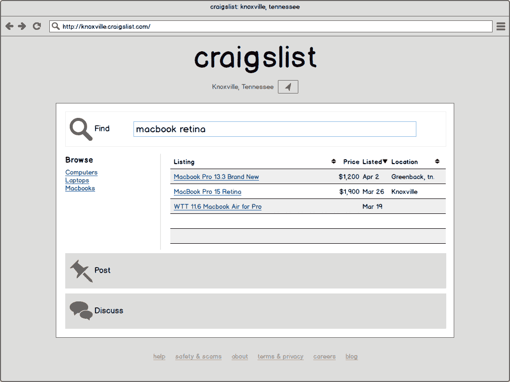
On the site’s current incarnation, the entire middle of the page is dominated by a massive list of categories in small text. For this prototype, we’ve done away with categories altogether in favor of tags. Tags can be much more specific and are more flexible than the existing category system. This is ideal for Craigslist. For instance, Craigslist has a category under “For Sale” for “Wanted.” Besides being illogical placement of this category, the “Wanted” category is not sub-divided at all meaning all wanted items get thrown into a single bucket. It doesn’t make sense to recreate all the “For Sale” categories under “Wanted” just to have better organization. If we implement tagging, we can keep the item categories and simply tag items as “wanted” to organize them properly. The available tags are defined by Craigslist and cannot be created by users. This would prevent the common problem of tag synonyms which makes finding data difficult in software that implements tagging.
To make things a bit neater, we could implement two classes of tags: one for categories and one for type of listing (e.g. for sale, wanted, event, job offered, job wanted). We then require the user to select at least one tag from each of the two classes. This way, things are still easy to find on the site and get sorted properly. The downside of tags is that they can be a bit too freeform. We wouldn’t want posts on Craigslist with no tags whatsoever.
In this design, an accordion in the center of the page lays out the three Craigslist actions. From the Search, search results refresh as the user types the query. In the left column, the user gets relevant tags. In the larger right column, the user sees individual posts matching search terms.
The user may switch to posting by clicking that accordion which collapses search and expands a posting form. The same is true for discussion which will show Craigslist forums right on the front page.
Prototype 2
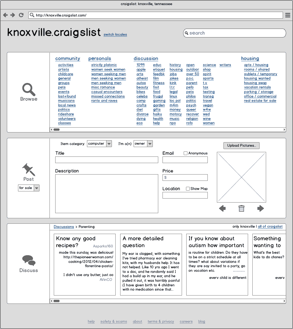
For my second prototype, I explored a slightly different premise: maybe part of the draw of Craigslist is that you see a plethora of interactions you can have directly from the home page. I left the category system intact and displayed them on the front page. With this prototype, I still kept with the three basic actions and gave them equal footing on the page. In the browsing and discussion panels, the user can scroll to the right to see the additional content in those areas. The posting form is displayed entirely within the width of the page for desktop resolutions.
For the discussions, I have used cards which display the most recent discussions in a given discussion category. The original post is displayed at the top of the card followed by responses as card space allows. Clicking on a card will open the full discussion. It might also be helpful to offer a more traditional listing of discussions as an alternative view in this pane.
Prototype 3
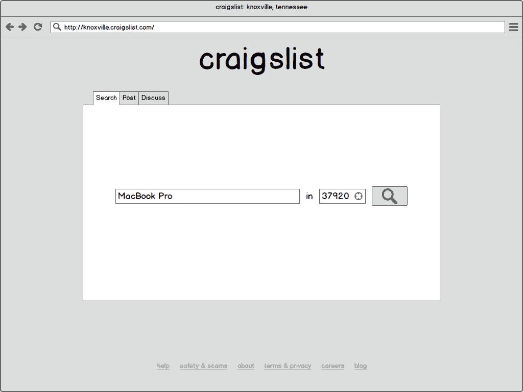
The third prototype is a slightly different spin on the first. Instead of an accordion control, it provides tabs at the top for switching between the three actions. Also, this design de-emphasizes location and bakes it into the search, posting, or discussion functions. In retrospect, this is probably the weakest element of this design. Most Craigslist users will want to use their locale for all actions on the site. As a result, the local setting should be made once and apply universally across actions.
The tabbed interface seems slightly more economical in terms of space than the accordion controls of the first prototype. It might be interesting to mix the best elements of these two.
This prototype also shows the least fidelity of those I produced. My mentor suggested I should have a step before the prototypes I produced above due to the time commitment required to produce them. If I had been a bit more low-fi with the first two, I could have produced even more prototypes and maybe have been less attached to any one of them. In particular, reproducing all the categories in the second prototype was a little silly and took tons of time for very little gain.
Takeaway
My first try at prototyping left me with several ideas for next time.
- Produce quickly at a low fidelity for the first pass. Next time, I will shoot for 10-20 minutes per prototype.
- Experiment with radically different designs. I got a bit hung up on the ideas from my first prototype and, although the second was much different, in general, I thought of the exercise as solved after that first one. I would like to force myself to produce a greater variety of ideas.
- Spend some time to learn the prototyping tools you want to use. If you’re using pen and paper, you’re already done with this step. For me, pen and paper is not a great option. I much prefer working digitally. I went through a few of the tutorials on my mockup tool of choice, Balsamiq Mockups.


